We all want our websites to accurately reflect the values, culture and personality of our businesses and nonprofits. We want to be relevant and engaging and have our content shared and our pages bookmarked.
Our website should be a platform through which we draw increasing numbers of subscribers, allies, potential donors and customers.
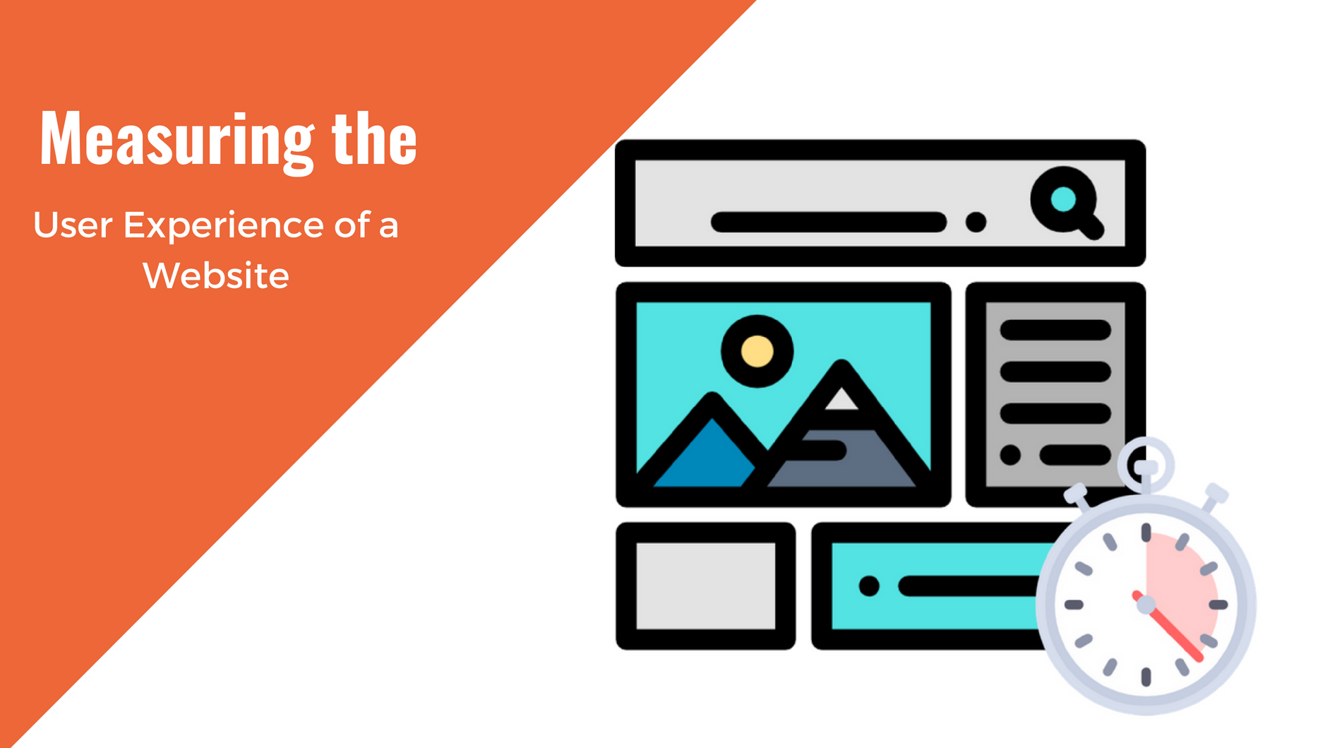
Our website is usually the first representation of our organization that people see. It is their introduction to our company, and therefore it is crucial to our success that their first impression is a positive one.
We don’t want people leaving our site prematurely because they couldn’t find the information they were looking for in a reasonable amount of time. We don’t want to lose first-time visitors because our fonts are too small or our color contrast is too harsh or our site was slow to load. We shouldn’t be getting a large number of bounces (exits) because our content doesn’t format well on a mobile phone or isn’t seen as high quality.
How Improving Your Website Can Strengthen Your Brand
There are several million other websites out there vying for those same eyeballs. Sites that are intuitive to use, informative and useful, easy on the eyes, engaging, etc. are going to be better positioned for success than sites that fall short of our visitors expectations. If a visitor isn’t having a satisfactory experience due to any of the factors mentioned above, they will leave and search those competing websites out.
In some of these instances, your visitors may end up on a similarly-themed website which is competing for those same eyeballs. And it isn’t because you have an inferior platform, mission, product or service. It’s not because your staff and daily work aren’t equal to other organizations; it’s because your website is negatively affecting your brand.
What are some of the factors that can cause an increased bounce rate, and how can we address them to retain more of our readers? What are some of the elements of design, user experience (UX) and content that we can change to allow our website to become something that strengthens and improves our brand?
Elements of design that can affect your brand
Let’s start with four areas relating to your site’s design:
- Site structure and organization
- Mobile-friendliness
- Effective forms and CTA’s
- Visual Aspects
As we run through the items, consider ways that your team can evaluate whether these factors are helping or hurting your brand. Various methods such as reviewing analytics, A/B testing, user testing and simple observation can help you in your decision.
Site Structure and Organization
When a visitor arrives at your site, are they able to find what they need to in an intuitive manner and with as few clicks as possible?
How you structure your layout and navigation is very important. If your website is confusing to a new visitor or if it is too busy visually for them to quickly find the information they are looking for, your bounce rate (exits) will suffer.
A logical, hierarchical menu structure and a smart layout (that keeps the important stuff visible and clickable) allow your users to efficiently scan the site’s offerings and quickly locate the area of content they’re looking for. Reduce clutter and minimize distracting elements that are vying for your users’ attention.
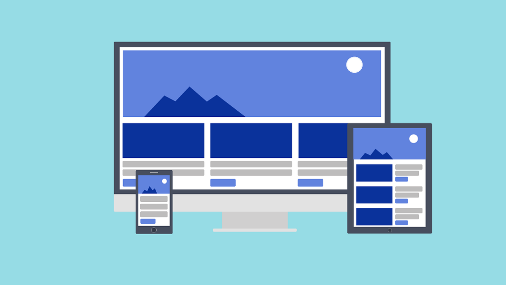
Mobile-friendliness
Although it has been almost nine years since the advent of responsively-designed websites, thousands of websites still do not have their content properly showing up across all screen sizes.
Some websites are still using fixed-width content areas which do not adapt to different devices. Others have responsively-designed websites but may need to be reviewed to make sure all content blocks, images, sign-up forms, etc. are correctly loading and formatted to work on all screen sizes and device types.
Not having a mobile-friendly site will not just be a source of consternation to your site’s visitors. It can also negatively impact your SEO. For the last several years, Google has stated that it will rank sites and pages that are mobile-friendly higher in its search page results than sites and pages that are not.
An easy solution is to conduct device testing either with online simulators or by testing on actual mobile devices themselves to see how all of the elements on your site are rendering for mobile users.
Effective forms and CTA’s
Your onsite forms and interactive elements can also play a role in retaining your site’s visitors. If your contact form or donation button aren’t easy to find, well-marked and properly working for all visitors, on all devices, you’ll lose out on those visitors and their ability to interact with and contribute to your organization’s success.
Pay attention also to the messaging and wording on your CTA’s and buttons. Make sure the text is easily understood and effectively messaged so that a click-through takes your visitors to a logical destination, whether that be a sign-up form, donation portal or product page.
Visual Aspects
The last design-related aspect of your website we’ll look at is your website’s visual appeal. This comprises color, text, branding and overall feel.
With color, some of the areas to consider include:
- Are you using colors that are too harsh, bright, dull or that clash?
- Is the background of your website and content area too dark or bright? Although some may insist that they prefer having lighter colored text over a black or dark background, many users find that prolonged reading on those sites tires the eyes.
- Similarly, many web denizens feel that a background of bright white (#FFF) can provide too glaring of a contrast, so most websites go with off-whites, tans and light grays for their content area background to provide a more comfortable, professional reading environment.
- Are you using too many colors on your website? Outside of images, which obviously have lots of colors, do you have too wide of a variety of colors in your headings, links, menu tabs, sign-up forms, CTA’s, borders, logo and site title? Most branding experts recommend no more than 3 or 4 colors used within your branded materials. It’s also important to make sure the colors you use go well together.
- Conversely, is your website too monotone, without any colors except for your links or header? If so, consider sprucing it up, building color up either with a monochromatic color scheme that borrows from the colors you use in your logo or letterheads or settle on some complementary colors that work well with each other and add to your site’s visual appeal.
Another visual aspect to consider is your text. Some text properties to evaluate include:
- Are you only using one top-level heading (h1) per page as recommended? This helps search engines’ web crawlers identify what is important on your page and to decide what pages to include in its search engine results pages (SERPs).
- Are all of your headings sized appropriately and hierarchically with an effective font size?
- For your body text, are you using a sans-serif font family which simplifies the reading experience? While it’s okay to have the occasional serif or handwritten style font for some of your larger text, such as headings, CTA button messaging or your site title, it’s best to keep your main body text as streamlined and no-frills as possible.
- How about your body text’s font size? Are some readers straining their eyes to make out your copy’s 9 or 12px size font and giving up halfway through a long article? Your web designer can reset your basic font size to 14-16 pixels for a more enjoyable reading experience for your visitors.
- For any text you have chosen to display overtop of an image, button or background color, have you made sure to slightly mute the image or soften the background color so that that text is clearly distinguished and legible?
Lastly, as regards the visual elements of your website, if your organization has some branding in place, are you presenting a unified experience on multiple platforms? Here, you want to make sure that your look and content, whether email blasts, sign-up forms, pdf’s, flyers, news articles or marketing materials, have a consistent, professional look.
After being on your website for a bit, will your visitors experience the same color scheme, visual elements and ‘personality’ when they go to your donate page or FaceBook account or receive an email alert from you? Consistency in look and feel builds trust, and that, in turn, will strengthen your brand.
Non-design-related Factors
There are also non-visual elements of your website which can contribute to your audience staying on your pages or leaving.
Three items that we’ll briefly look at include
- Your content.
- Your accessibility.
- Your page speed.
Content
The main thing that people on the web are looking for is useful, relevant and informative content. They’re not on your website just to kill some time. There was something in a search or an article or web referral which piqued their interest enough to click on through and end up on your organization’s website. Now what?
Is your site threadbare and lacking in content? Just as unappetizing to an interested visitor, does your site have a truckload of content but most of it is not quality content? Either scenario will result in more bounces (exits).
Additionally, poorly put together content will impact how people find you. To be ranked high in SERP results and reach potential visitors you should be providing useful, relevant content that is at least 300 words long, informative and SEO optimized.
If you are an organization or small business without a lot to say, there are still ways for you to fill out your website with quality, SEO-friendly content. You don’t need to have 50 brilliant posts or a compendium of pages; even a well thought out and properly designed and optimized site with just one to three pages of content can still rank well in the SERPs.
It’s important to make sure you have a few well-written posts or pages onsite dealing with your cause, service or product. You can also include informative background information and customer feedback, such as uploading your mission statement, including user or donor testimonials and even hiring out to a professional writer if you’d like to generate better copy.
Don’t be reliant on just one type of content. If you have an article and text heavy site or you have an almost exclusively image based portfolio site, consider what other types of content can compliment your main output. Have a variety of content types on your site and display them smartly and attractively in a manner that makes sense for a first time visitor.
Accessibility
Is your site accessible? If you are a 501 3c you already have to be in compliance with accessibility requirements. However, if you are not required to be accessible or section 508-compliant, do you really want to alienate almost one seventh (15%) of the world’s population? At almost one billion people, that’s a lot of potential eyeballs, subscribers, donors and potential customers you could be overlooking.
The AmDee blog has provided numerous posts on accessibility over the years. Here are a few from the past 18 months which you may find useful in converting your site into an accessible website:
- How Designing for Accessibility Will Improve User Experience (Part 1)
- How Designing for Accessibility Will Improve User Experience (Part 2)
- Convincing Your Client Site Accessibility Matters
- WordPress Themes and Plugins for Accessibility
There are also numerous guides on the web which can help spell out what types of things you can do to be accommodating to screen-readers and other assistive technology. While much of that work would need to be done by developers who are familiar with WCAG 2.x requirements, some of the testing can be done with a minimum of technical knowledge. These may include checking your pages’ contrast, navigating without using your mouse by using the tab keys and ensuring the alt-text fields for images are filled out in a way that provides useful information for a user who may be using a screen reader.
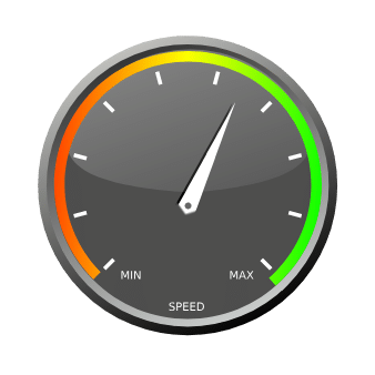
Page Load Speed
The last item we’ll look at is your site’s page load speed. It should go without saying that if your site’s pages don’t load within a relatively short time frame of around two or three seconds, your prospective visitors won’t be sticking around to see what it looks like, nor will they be returning or recommending your site to others.
Page load speed matters to search engines, too.
As Neil Patel notes: “Google and other search engines penalize sites that load slowly—but more importantly, so do users.” His How Loading Time Affects Your Bottom Line infographic found that 40% of web users abandon a website that takes more than three seconds to load.
You can monitor your page load speed by using various online trackers such as the Chrome browser extension Page Load Time. If you can get your page to load in approximately two seconds, you’re in the ballpark of what your web visitors expect to encounter as far as speed goes. If your page load time is over three seconds, you have some work to do to ensure that you won’t be losing a sizable percentage of your prospective fans, donors and customers in the future.
A pair of great tools to help you with this are Google’s PageSpeed Insights and Pingdom’s Website Speed Test.
Some items that you and your web developer can look at to reduce your load time may include caching, image optimization (and properly served sized images), hosting bandwidth, making sure your embedded videos are hosted offsite and using minimized js and css files. Getting your page load speed down to a manageable two seconds or so will go a long ways towards reducing your bounce rate.
Conclusion: Improving Your Website Is Improving Your Brand
Through the process of evaluating your website, assessing the changes you can reasonably make and proactively remedying any site elements which may be adversely affecting your brand, you can strengthen your online presence and reduce your bounce rate. Along the way you will also be improving your SEO and keeping more of your readers engaged. This will hopefully translate into more sign ups, subscribers, donations or purchases for your organization.
Site evaluation and improvements don’t just happen on their own, however. It is worth your organization’s time and budget to assess which aspects of your website’s design, content and overall UX (User Experience) are having a negative impact on your brand and web traffic. Some of the results may surprise you and may be quite simple to address or fix. In the long run though, conducting regular (or at least occasional) audits of your website will empower you to discover possible areas of improvement and implement any needed changes. This in turn will keep your audience satisfied and growing, and keep your brand on an upward trajectory.
For further reading on improving or redesigning your website:
- 4 reasons to launch a website redesign project
- 4 steps to master the website redesign process
- Debunking the 7 most common web design myths

Jeff C.
Jeff Creamer is a DC-based WordPress website administrator, tutor and consultant. He has been helping small businesses and nonprofits launch and manage their WordPress sites since 2013.

Kristy Bauman
You May Also Like
Having a website is an absolute necessity for any business. Gone are the days when you could simply update your website once and forget about it for months on end. In today’s ever-changing digital landscape it is important to constantly track and measure how well your website performs, as well…
read more >
Thomas Bertram (T. Bert) Lance famously said, "If it ain't broke, don't fix it." Unfortunately, T. Bert Lance couldn’t foresee the future. He didn’t know that over 94% of Americans would be on the internet by 2024. If your website doesn't receive periodic updates or isn't accessible, users can become…
read more >