As a website owner, it’s natural to want to implement all the hottest trends in web design. After all, FOMO, or the fear of missing out, is a real thing.
And the last thing you want to do is fall behind because you aren’t implementing popular trends.
That said, there are some common web design myths that don’t seem to want to go away no matter what. And you should be careful about following these trends just because they’re popular.
This is especially true if you’re not a professional web designer and are just looking to create a highly converting website that your site visitors love.
Of course, we’re not saying that all web design trends are to be avoided at all costs. In fact, some of these long-lasting (or newly emerging) trends might be just what you need to give your website a boost.
However, it’s important to think about why a web design trend is popular and why people are adopting it before you jump into using it for yourself.
So, let’s take a look at some of the biggest web design myths and misconceptions that website owners of all kinds are guilty of believing, even when it’s not in their best interest.
Below we outline the 7 top website design myths and practical solutions you can use to tackle them.
1. Once Your Site is Live It’s Finished
One of the longest living myths in the online word is that once you’ve published your website it’s done. This idea couldn’t be further from the truth.
Sure, you’ve put a lot of time and effort into visual design, functionality, testing, and adding preliminary content. But websites needs routine maintenance and upkeep once they’re pushed live. If you want your website to be seen on a regular basis, maintain people’s attention, and generate money or donations, you need to continually add new things or tweak minor elements to keep it fresh to keep your users to be engaged and coming back for more..
Here are some of the best ways to prevent your website from becoming the most out-of-date site on the internet:
- Start a blog or news section and consistently add valuable content that your site visitors can read and enjoy.
- Test website functionality like links, web forms, and navigation menus, making sure it easily works not only on a computer but on phones and tablets as well. This is especially important if you’re noticing that there are pages that are getting a lot of traffic visiting but the links, forms or menus aren’t being utilized.
- A/B test. Things like web forms, landing pages, CTA buttons, layouts, color schemes, and fonts can be routinely tested to see which yields better results.
- On evergreen content, change up outdated images and ensure content is still relevant. This gives people something fresh and new to look at.
- Monitor the speed and performance of your site to prevent abandonment.
Optimize your site for better search rankings (e.g., keywords, image compression, and content readability)
It’s important to also track your site’s data in a tool such as Google Analytics. Keeping track allows you to make sure your site traffic is growing, conversions are up, and you are generating the revenue or collecting online donations you need to keep your organization going.
All of these things, and so much more, need to be done regularly, even long after your site first goes live.
2. Accessibility = My Website Works on Mobile
Web accessibility goes beyond creating a website that works well on mobile devices. Of course, it’s important your website renders on mobile devices; according to a recent survey, in 2018, 52.2% of all website traffic worldwide was generated through mobile phones.
But accessibility does not mean the same thing to everyone. There are many technical terms floating around; “accessibility”, “usability”, and “inclusion” are closely related but are not all equal. For our purposes, an accessible website will meet, at a minimum, 508 compliance guidelines. For more information about 508 compliance, we recommend inspecting the legal text on the US access board.
There are many factors that play into an accessible website that you should focus on. Some common criteria you should meet to make your website accessible are the following:
- A website that’s keyboard-friendly, meaning someone can navigate it without using a mouse.
- Make sure colors maintain a good contrast ratio to stand out against the background. We recommend using a tool such as WebAIM to check the ratio.
- Ensure all content is readable by screen readers, even dynamic content that changes.
- Add alt-text to all images, videos, graphics and anything non-text based.
- Clearly label all form fields on web forms and provide instructions where needed.
- Keep any tables you add to your site simple (for complex tables check out this guide by W3C).
- Avoid playing video content automatically and having distracting things like carousels or sliders which don’t work with a lot of AT (assistive technology).
- Give links unique and descriptive names.

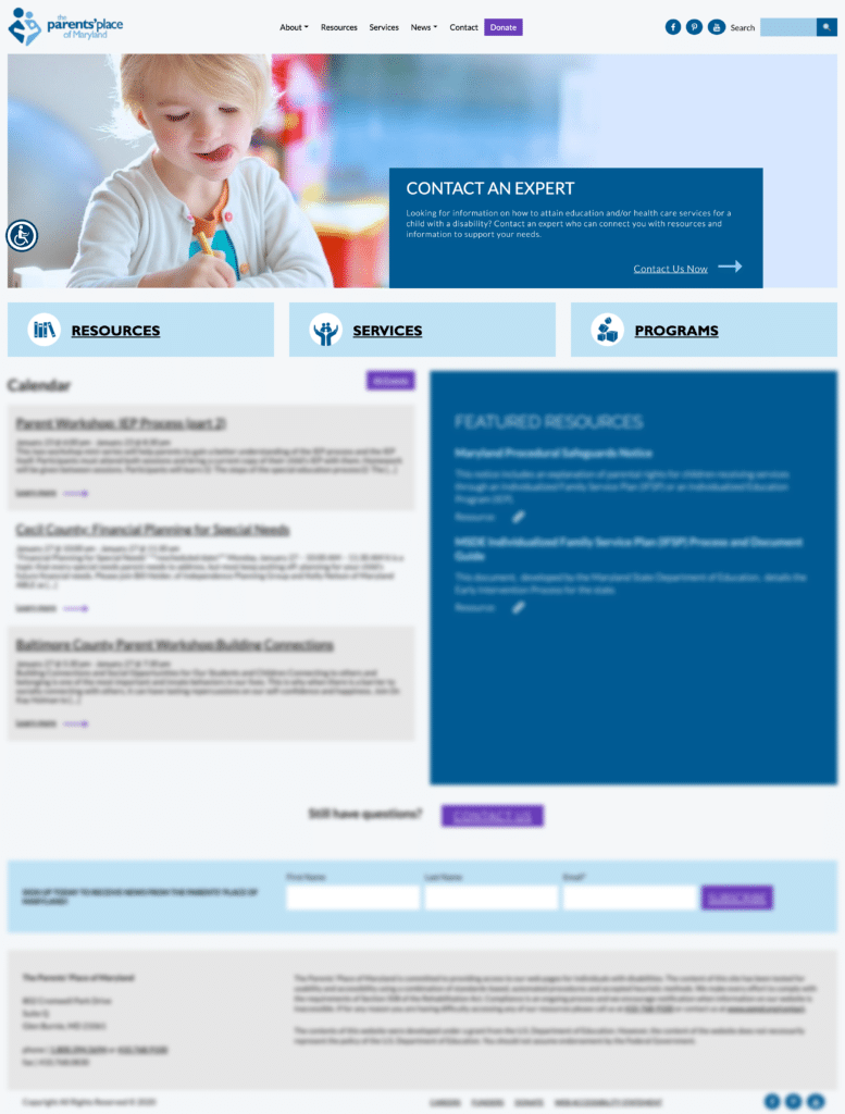
ECAC does a great job of using complementing color schemes, clear and simple font styles, large images, and descriptive link names. Plus, anywhere on the site a user needs to do something (e.g. search for a specific term) there is a clear, written description of what needs to be done. (Image Source)
If your website is accessible, it means that the barriers preventing people from accessing or interacting with your website are removed.
Adding to that, people with varying degrees of disabilities (e.g. blindness, cognitive impairment, motor skill trouble, deafness, and more) have a hard time accessing and thoroughly interacting with websites that are not accessible.
So, your website working on screen readers alone is not enough. Take the time to make sure all elements on your site are accessible to everyone. It’s not only the right (and legal) thing to do, it’ll help you reach a broader audience too.
3. You Can Design a Site Now and Make it Accessible Later
It may seem like you can design your website however you want, launch it, and just come back to it later to make it accessible.
But when you take a step back and think about, this is counterintuitive and just doesn’t make sense. After all, the way you make a website accessible it to design it to be usable for everyone.
If you design a site and push it live, and then come back to make it accessible, you’re essentially redesigning your entire website. On top of that during the time that you’re redesigning your site for accessibility, people are visiting it and possibly running into barriers as a result of it’s inaccessibility.
Accessibility matters more now than it ever has. If you want to take the right approach, meet the public’s expectations, and conform to the laws in place regarding site accessibility, you’ll have accessibility in mind the entire time you design your site.
And this approach should follow you long after your site goes live and you continue to add content to your website.
4. Your CTA Must Stay Above the Fold
When you hear the term “above the fold,” we’re referring to anything a site visitor, on a desktop, can see on your website immediately once they arrive, without scrolling down.
Of course, not all screens are the same, and your website may render differently depending on the screen resolution. But the general area that’s considered above the fold on a website is approximately 1,000 pixels wide and 600 pixels tall.
With that said, there’s an old myth out there that says your calls to action must always be above the fold. And while this may work well for some websites, there are always exceptions and your site might be one.
Your site visitors can be divided into two main groups: certain visitors and uncertain visitors.
Certain visitors are those that land on your site already knowing that they want what you have to offer. For these people, having a CTA above the fold is ideal. This way, they don’t have to hunt around to make a donation, signup, or request an appointment.
Uncertain visitors are those that aren’t sure you have what they need. These people need more information before they make a final decision about whether to convert. This is an instance where having a CTA below the fold, below additional information about the business, is helpful.
Don’t believe us?
Neil Patel A/B tested two versions of his homepage: the current one with over 1,200 words and form fields below the fold, and a new one with only 488 words and form fields higher on the page.
In the end, the longer homepage converted 7.6% better than the shorter one that crammed everything above the fold.
Adding to that, a study by CXPartners found that having very little text above the fold actually encourages people to scroll down and read more.
Even a case study conducted by Content Verve found that a below the fold CTA outperformed an above the fold CTA by 304%, proving that sometimes below the fold is best.
5. It’s All About Looks
Sure, having a beautifully designed website is great for those attracted to visual design. But your site needs to do more than just look pretty. It needs to have relevant and helpful content, placed where your users can easily find it.
Your site’s content should always guide your site’s design. In other words, blog content, conversions goals, product pages, landing pages, and more should influence the overall design of your website and its functionality.
After all, if your website is all show and no value, your business or organization will never thrive because people will come, like what they see, and hate what they cannot find. If you leave site content for the end, you’re setting yourself up for failure.
Web design is about more than just color schemes, graphics, and font styles. User experience, interaction, and site functionality all play an important role.
And while pure visual web design can make your site look great, it does little to help make up for a lack of content, poor engagement, low traffic numbers, and low conversion rates.
Your website’s visual appeal is a critical part of web design. But so too is its layout and the ease in which people can navigate your beautiful site. If your website looks good but doesn’t entice people to take action (e.g. subscribe, read content, or buy), you’ll never see the results you want.
6. Your Homepage is the Key
A homepage is one of the most important parts of any website. But some people are under the mistaken impression it’s the only thing that’s important when it comes to web design.
And that’s just not right.
Think about it. Some people will never see your website’s homepage unless they actively click on it while exploring other areas of your site. They may have landed on a blog post from search results, a product page from a paid ad or affiliate link, or even a landing page from a social media post.
Whatever the case may be, your site visitors are likely to land on many different pages depending on their individual circumstances. As a result, you should focus your design efforts equally throughout your website so that no matter where people land, the design and user experience are consistent.
7. If It Looks Good On Your Computer…Everything is Fine
You should know by now that people come to websites from a wide range of device types.
Desktop computers, tablets, and mobile phones all have different screen sizes and render websites to users in different ways.
Thinking that because your site looks great on your computer, it will look good on all computers and devices is a myth that needs debunking right now.
In order to have a successful site, you need to be able to incorporate good web design into multiple devices.
If you’re not sure how your site looks when it loads on other device types, check out this neat (and free!) tool Responsive Checker.
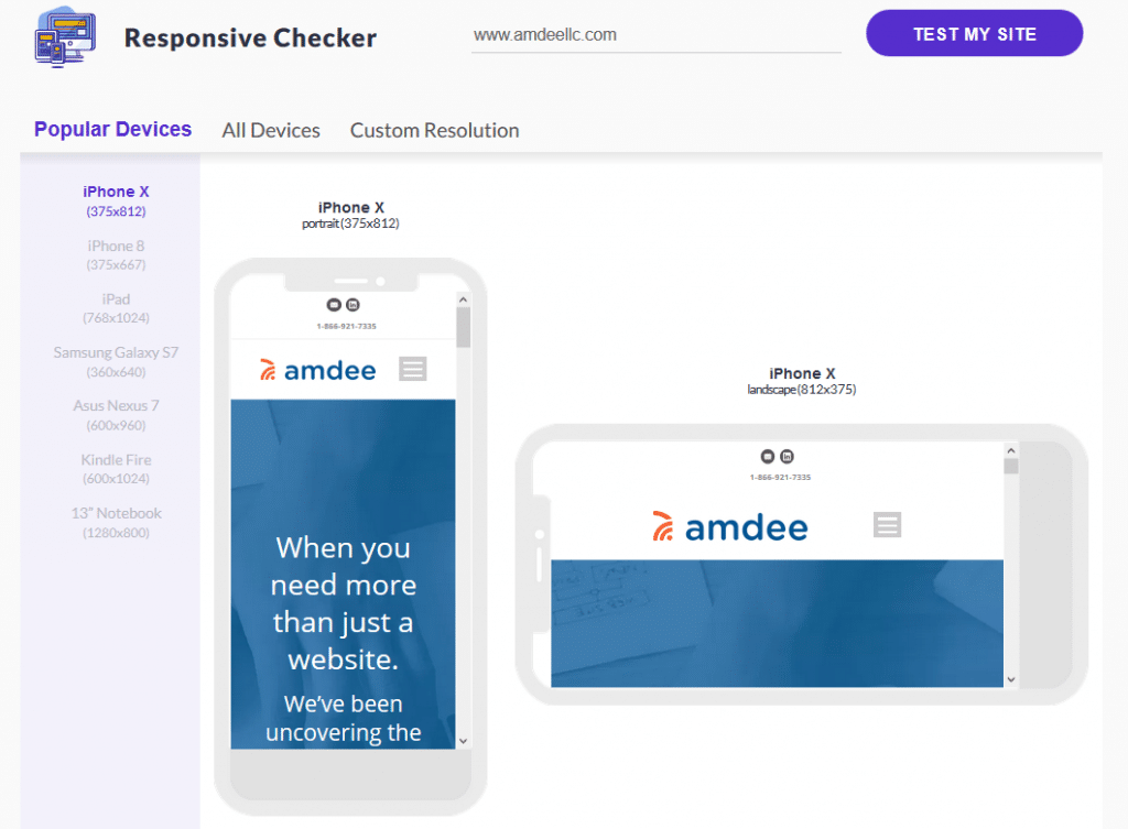
With it, you can see how your site displays on any kind of device type imaginable. Plus, you can navigate your site in real-time to make sure pages other than your homepage look and function the way you want.
Lastly, keep in mind that all websites that are responsive by design are mobile-friendly. That’s because responsive web design means your website will adjust to render seamlessly on any size screen. That said, not all mobile-friendly websites are responsive.
Being mobile-friendly means that your website displays on all devices, no matter the type or screen size, the exact same way. With a mobile-friendly website not using responsive design, there are no screen adjustments.
Final Thoughts
Myths are not always widely held false beliefs or ideas. In fact, many web design “myths” were once deemed best practices by even the most experienced web designers. But things change, ideas evolve, and site visitors demand different things from the websites they visit.
It can be tough to break old habits, especially when you think what you’re doing is right. But it’s your job as a website owner to stay up to date on all the latest trends, discern between the ones that are right for you and your target audience, and implement that design on your site. It’s also your job to avoid falling victim to web design myths that hurt you more than help you.
If you need help with your website’s overall design and want to ensure it’s accessible as well, get in touch with us today. We can help you develop a plan for your website that ensures a seamless user experience, incorporates the best web design practices, and is accessible so everyone can enjoy what you have to offer.
best practices design trends
Lindsay L.
Lindsay is a freelance writer who loves all things WordPress. When she is not writing she can be found spending family time with her son and two silly nephews.

Kristy Bauman
You May Also Like
Having a website is an absolute necessity for any business. Gone are the days when you could simply update your website once and forget about it for months on end. In today’s ever-changing digital landscape it is important to constantly track and measure how well your website performs, as well…
read more >
Thomas Bertram (T. Bert) Lance famously said, "If it ain't broke, don't fix it." Unfortunately, T. Bert Lance couldn’t foresee the future. He didn’t know that over 94% of Americans would be on the internet by 2024. If your website doesn't receive periodic updates or isn't accessible, users can become…
read more >