In our introductory post on Gutenberg, we covered the changes in the new editor, how it affects your different staffers (admins, editors, developers) and how you and your team can prepare.
This follow-up post on Gutenberg’s content blocks and options will be primarily useful for those who do the writing, editing and content uploads for your WordPress site. But will also be of interest to non-writers and general WordPress users curious about the changes. It covers the new editor window interface, lists out the available blocks in Gutenberg and touches on several blocks’ editable properties within the editor window.
As noted in our earlier Gutenberg post, the new editor will treat each paragraph, image, button, etc. as its own “block.” Some aspects of the new editor and workflow will be akin to working with a WYSIWYG site builder. WordPress will be giving you the option to use the Gutenberg editor, the classic editor or even a combination of both on a per-page, per-post basis. Previously published posts and pages can remain as they are or be updated and re-edited with the new Gutenberg editor.
For more on these topics, see the Resources section at the bottom of our previous Gutenberg article.
Inside the New Editor Area
When you create a new page or post in the Gutenberg editor, you will find a new menu with four symbols at the top left of your editing area. Clicking on the encircled “+” sign will add a new block below the title field. The two curved arrows in the middle are for undoing and redoing your last edit. Clicking on the “i” symbol on the right presents you with document information such as word count, document outline and more, as shown in the screenshot below.
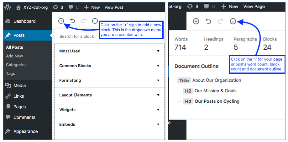
The “Add Block” button and its dropdown menu (left); the Document Info button and its contents (right).
In the column to the right of your content area is the other section of the new WordPress editor. Here you will find most of the elements you are used to seeing, such as publishing information, date, category, tags, etc., but presented in a more compact form with the blue Update/Publish button atop the column. From this vantage point you can select to view either the Document pane or the Block pane. As seen below, the Block pane shows you the editable parameters of the block you are working on. For example, with the Paragraph block selected, its text size, drop cap, text and background colors can all be edited from within the post editor window.
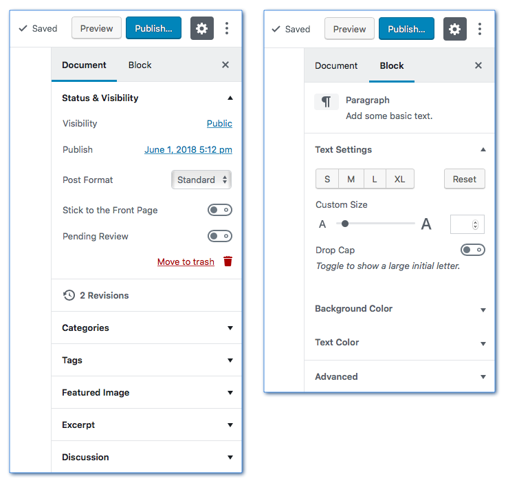
The panel to the right of your post or page can toggle between “Document” for viewing and editing publishing information (left) and “Block” for the editable parameters of the selected block you are working with (right).
The gear icon, situated just to the right of the Publish/Update button, allows you to show or hide this panel, while the ellipsis (the three stacked dots icon) presents a dropdown menu which allows you to select Visual vs. Code Editor, Show/Hide Tips, Fix Toolbar to the Top and a tool to Copy All Content.
That is the extent of the main changes you will see when writing posts and pages in the new WordPress editor; the Add Post button section above your content area and the Document/Block panel to the right of the content area.
Gutenberg Blocks in the New WordPress Editor
The new Gutenberg editor allows us to use more than 25 different blocks when constructing our posts. When you add a new block to a page or post, you are presented with a dropdown menu listing several categories of block types:
- Most Used
- Common Blocks
- Formatting
- Layout Elements
- Widgets
- Embeds
Expanding each block type submenu lets you view each of the blocks available in that category along with their respective icons.
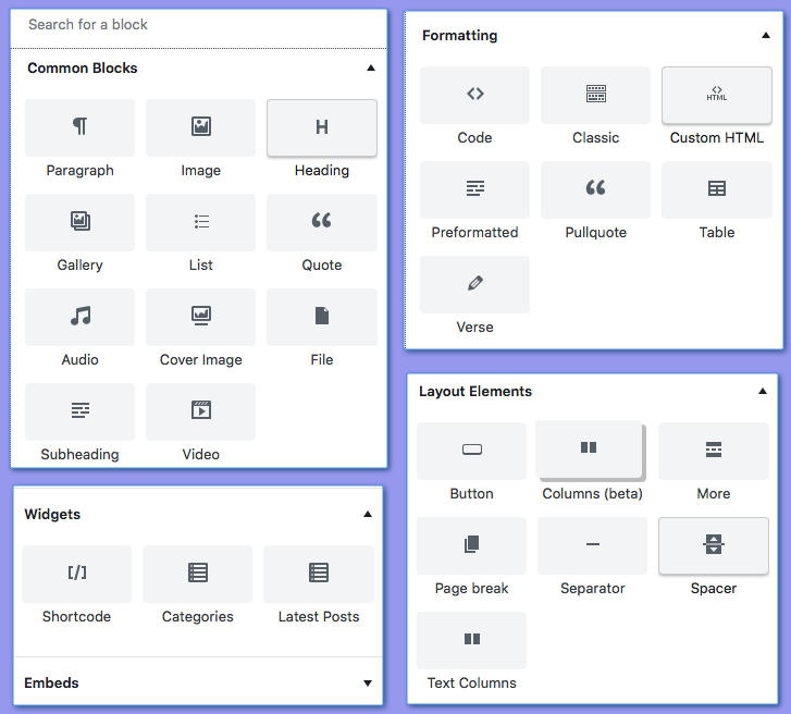
Clockwise from top left: the available Common Blocks, Formatting Blocks, Layout Elements and Widgets.
Additionally, there is a Search field directly above the Common Blocks submenu. Here you can type in the name of the block you are looking for to save yourself some time or if you are not sure which submenu contains the block you want to use.
While it would take a small booklet to describe and go over each of the blocks and their editable parameters in depth, here is a brief rundown of all of the items in the block type submenus.
Most Used
The Most Used blocks submenu will populate with the blocks you utilize the most while you are working. This can be a time saver if you tend to only use four or five block types over and over in your posts. The WordPress editor will make note of which blocks you repeatedly use and put their icons into the Most Used blocks’ submenu at the top of the blocks’ list for quick and easy access to them.
Common Blocks
Next down the blocks’ menu are the Common Blocks. This is a static list of the most commonly needed and used blocks for everyday writing. The Common Blocks list includes:
- Heading
- Subheading
- Paragraph
- Image
- Cover Image
- Gallery
- List
- Quote
- Audio
- Video
- File
Notice that all of them except the Audio, Video and File blocks are ones you have seen before in the WordPress editor. And whereas in the old WordPress editor (referred to now as the “classic” editor) you would click on the “Add Media” button to add an mp3, video link or PDF, now you can select them as Audio, Video and File blocks respectively.
Two of the Common Blocks worth touching on briefly are the Image and Paragraph blocks.
The Image block in the new WordPress editor allows you to have all of the options you had previously, relating to size and alignment, but now comes with two new display options: wide-width and fullscreen. Wide-width lets you insert an image into a page or post which displays wider than your theme’s default content area. The full width option displays your image across the entirety of your web page (given that you are using a full-width enabled theme).
The Paragraph block, as shown in the second screenshot above, now allows you to adjust the text size and color, background color and to choose if you would like to use a drop cap or not.
As noted earlier, the new WordPress editor will convert all of your paragraphs into separate blocks. However, this does not mean that you have to manually select a new paragraph block for each new paragraph. When you are typing in your paragraph block, once you hit the return key to start a new paragraph, WordPress will automatically create a new paragraph block for you and you can just keep typing uninterrupted.
Formatting Blocks
There are seven formatting blocks:
- Code – Add text that respects your spacing and tabs; -perfect for displaying code.
- Classic – The Classic editor block (discussed below).
- Custom HTML – Add your own HTML and view it in the right hand panel as you edit.
- Preformatted – For preformatted text; also allows styling.
- Table – Insert a table into your post. (See screenshot below).
- Pullquote – Highlight a quote from your post or page by displaying it as a graphic element.
- Verse – Display haiku or poetry verse.
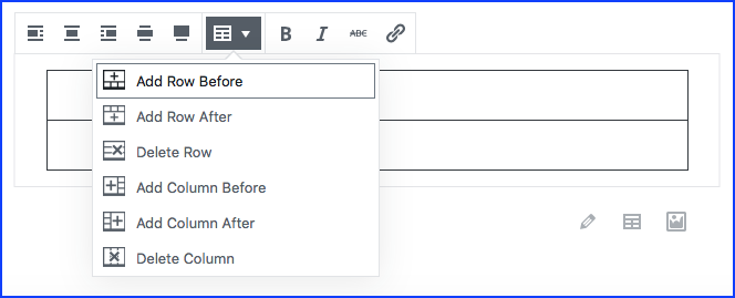
The Table block as it appears in the post body editor.
Of special note here is the Classic block. It allows you to have a Gutenberg editor-based page using all of the new block types such as wide-width and full width images, multi-column text, buttons, etc. Then, when you enter a stretch of your post or article that doesn’t need any of those, you can select the Classic editor block. This allows you to choose any element from the classic editor such as paragraphs, headings, the read more tag, horizontal line and others without having to use the Blocks menu for each individual element. While working inside the Classic editor block, you can write text and add page elements just as you always have.
The Classic editor block is a great addition to the blocks options and affords you the opportunity to work in a sort of hybrid mode, not relying exclusively on either just the new Gutenberg editor or the Classic editor. This enables you to switch seamlessly between the two experiences depending upon what you feel is the most efficient for your workflow.
Layout Elements
There are seven layout elements:
- Button – Add a button to your post or page without using code or a plugin.
- Columns (beta) – Add a block that displays content in multiple columns, then add whichever content blocks you’d like to each column.
- More – The Read More button.
- Page Break – Add pagination to your post or page from within the editing area.
- Separator – Add a horizontal line.
- Spacer – Add an element with empty space and custom height to put vertical space between page elements without having to add non-breaking spaces or padding to the elements below and above.
- Text Columns -Add text, and display it in two to four columns, like a newspaper. This block is experimental.
Currently, the Button block is still rather primitive in terms of the styling options it offers. While you do have control over the text and button colors, at the time of publication you cannot edit things like button size, border radius or shadowing. There is an example of a simple button in the screenshot below.
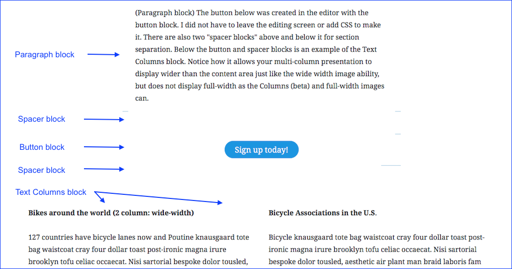
The Paragraph block followed by several Layout Element blocks (Button, Spacer and Text Columns blocks).
The Spacer block gives you two ways to adjust its height. In the right panel, you can enter the number of pixels needed for its height. In the post editing area, you can drag two vertically stacked points closer or farther away from each other to visually set the height.
The Columns (beta) block can display full width and does so without left or right padding at present. While this is fine for some elements such as images in the outer columns, use the Text Columns block for newspaper or magazine-style text columns. And, as its title infers, the Columns (beta) block is still in beta.
The other Columns block, Text Columns, will display at wide-width. In the example below, I’ve combined the Text Columns block with some of the other Layout Elements and a paragraph block. Note how the Text Columns block displays wider than the theme’s default content area width (shown here by the width of the paragraph block).
Widgets
There are three widgets available from the blocks’ menu:
- Shortcode – Use this block to add shortcode for any of your plugins.
- Categories – Displays a list of all of your site’s categories. Allows you to display the list as a dropdown, show post counts or display category hierarchy.
- Latest Posts – Displays a list of your latest posts. You can choose to display them as a grid or list, can select the order, number and/or category of posts shown and decide whether or not to display post dates.
With the exception of simple embeds, that covers all of the blocks available by default in the Add Block submenus. For further information on any of the blocks listed above, please consult the WordPress Codex and Gutenberg handbook.
Embeds, Shared Blocks and Custom Blocks
Finally, in addition to the standard blocks listed above, WordPress 5.0 allows us to create Shared Blocks and Custom blocks, and offers numerous embed blocks.
Embeds
Underneath Widgets in the Blocks menu is the Embeds submenu, where you can find more than thirty types of embeds you’ll be able to add to your posts, including Instagram, SoundCloud, Animoto and dozens more. Simply select your chosen embed type and enter the appropriate url in the given field.
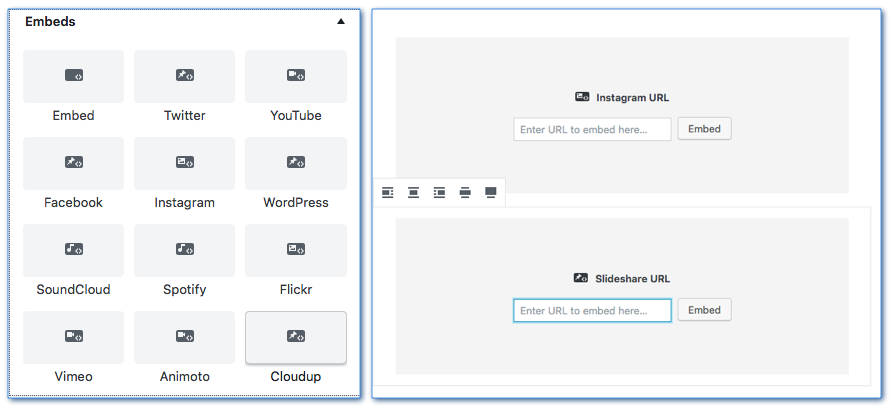
The Embeds submenu (left) has over 30 embed types available. Simply choose your desired embed block and enter the appropriate url (right).
Shared Blocks
Whenever you and your team have a content block that is repeated throughout your site, such as a specific button, call-to-action paragraph, logo, disclaimer text, etc., you can turn those content types into what is called a Shared block. This allows you to insert that content anywhere on your site without having to recreate it or copy and paste code. Simply save that block as a Shared Block. Then when you next come to a section that needs that element, choose to Add Block and select the Shared Block submenu at the bottom of the list. Be aware that the Shared Block option will not appear in the dropdown menu until you have created at least one.
With Shared Blocks, you can change or update content within the block to keep it current, and those changes will reflect immediately, sitewide, everywhere that the block is used. If you ever need to “unhook” a specific instance of a Shared Block so that it is independent of the others, open that particular block to edit it. Click on the ellipsis dropdown menu to the right of the post and choose “Convert to Regular Block.” All of the other instances of that Shared Block will remain the same and now you are able to leave the current block as a regular block or give it a different name as a new Custom Block.
Note: Shared Blocks were formerly known as Reusable Blocks. Some folks believe the name should be changed back to Reusable Blocks before Gutenberg is released, while others have suggested they be called Global Blocks. We will update our post’s information when the name is finally settled upon.
Custom Blocks
Last but not least, you have the ability to make custom block types in the new WordPress 5.0 editor. There are several ways to do this, either with a plugin or with help from your developer. There are already a growing number of plugins expressly for this as plugin authors begin to get a handle on Gutenberg’s capabilities and semantics. You can find the latest offerings by searching the WordPress plugin repository for “Gutenberg” or “blocks.”
And as developers, theme and plugin authors, writers and everyday users continue to get their feet wet and explore the new WordPress block-based editor, you can expect a whole host of new and exciting content types, stylistic capabilities and useful innovations going forward.
Wrap-up
The new Gutenberg editor provides an exciting new way to create content within the WordPress CMS using blocks and new content types that weren’t available in the old (classic) editor.
Keep in mind that you have three options in front of you: use the new Gutenberg editor, continue using the Classic editor only, or use the Classic editor block within the new editor.
gutenberg wordpress tutorial
Jeff C.
Jeff Creamer is a DC-based WordPress website administrator, tutor and consultant. He has been helping small businesses and nonprofits launch and manage their WordPress sites since 2013.

Kristy Bauman
You May Also Like
Whether you are new to using WordPress or an old pro having a customized dashboard can save you time. After logging into WordPress, the first thing you see is the dashboard. This is a collection of widgets that provide users a simple way to find useful information without the need…
read more >
Even the best content in the world is useless if nobody hears about it. But WordPress has you covered thanks to a wide range of social media plugins that help spread your content to the people that matter. The challenge is now finding the right plugin. There are over 51,800…
read more >