There is no doubt that WordPress is the most popular Content Management System (CMS) because of its variety of features and customization options. You can create any kind of website with WordPress, and there are thousands of plugins and themes available in the WordPress gallery you can choose from.
However, in today’s age where 41% of the population within America access the web via mobile devices, it’s imperative you make your website mobile friendly, the number of mobile internet users are overgrowing. According to Statista, by 2020 there will be 275.9 million mobile phone internet users within the United States.
While it isn’t cause for immediate panic it is important to note that without a responsive website it is possible that by 2020 half of your audience will leave your site because it isn’t responsive. 57% of users say they won’t recommend a business with a poorly designed site. This includes those which aren’t tailored to look good on mobile.
Now is the perfect time to start worrying about your users viewing experience across all devices. You’ve completed the first step in this journey by identifying that your website is not responsive. The next step is to implement these 6 easy solutions to create a responsive website.
How to Make your WordPress Website Mobile-Friendly
- Use a Responsive WordPress theme
- Speed up Your Website
- Use Simple Designs
- Limit your WordPress Plugins
- Implement AMP (Accelerated Mobile Pages)
- Stick with Simple Fonts
Use a Responsive WordPress Theme
The most comprehensive solution, if you haven’t updated your website for a while, is to create a whole new website. Now if you are going this way you need to choose whether you will use a free, paid or custom theme which we have outlined in our previous article.
If you are going to use either a free or paid theme we recommend that you choose one that is responsive, and ideally is also accessible ready. Take a gander at other inspiration for accessible ready theme inspiration and plugins.
However before you purchase any new theme, you should check a few things for yourself:
- Whether the theme is mobile responsive or not. You can do so with a demo version of the theme and looking at it on your computer, mobile and tablet devices.
- Make sure the theme gets updated regularly. These upgrades may bring mobile-friendly elements and help your site be friendlier to users.
- Check reviews regarding the theme you are planning to buy.
Speed up Your Website
In previous articles, we have outlined why website speed matters. Users don’t have any time to wait for your website to load. If your website doesn’t load in under 3 seconds, it is very feasible that you will lose your audiences as well as your ranking on Google.
To keep users on your website, you need to ensure it loads quickly.
The first thing you need to consider is your hosting. If you are using a subpar hosting company your website could be slow without any other faults. A premium web hosting ensures that this doesn’t happen. WPEngine is one of the best WordPress hosting providers. It is one that AmDee often recommends for our clients and is beneficial as they only host WordPress sites. If you need more advice on how to choose the right web hosting company read our quick guide.
Other steps you can take to increase the speed of your website:
- Minify the HTML, CSS, and JavaScript codes.
- Optimize your images. If your website relies heavily on images use plugins such as WP Smush as well as a plugin such as WP Retina 2x
Use Simple Designs
A beautifully designed website grabs users’ attention. If improperly done these attention grabbing elements can become dense with extra HTML and CSS. These heavy designs can further slow down your site especially if you are on shared hosting.
Most of the time a user is coming to your website for the content, not the flash of the showman. A primary rule of a good website is to ensure it provides the user with the information they are looking for.
The easiest remedy for this: Keep the design and the code behind the design simple.
Limit Your WordPress Plugins
While there are thousands of Plugins, and you may be tempted to try to use as many as you think are helpful, it is possible that you may have too many plugins installed. if you are using too many WordPress plugins, then you are not just slowing down your website but also driving your viewers away.
As you begin to use more and more plugins you use can create a massive load on your server, especially if you are using shared hosting. Once this happens, your site won’t load properly. It can even cause your site to show a 404-page not found page.
So if your website has been around for a while, it may be worth your while to review the plugin’s tab of your WordPress dashboard.
Find any plugins that aren’t actively being used and remove them. If you have plugins that haven’t been updated in a while either update them (after checking for compatibility) or find a more modern solution that is regularly updated that can be its replacement.
Implement AMP
AMP also known as Accelerated Mobile Pages, is an open-source project by Google. It helps websites to load pages quickly by producing pages utilizing HTML. By implementing AMP on your WordPress site, you will have the ability to offer nothing but a smooth and fast surfing experience for users.
Using AMP results in rapid loading times on almost any device.
Additionally, Google also ranks higher those websites that are powered by AMP in mobile search results.

Stick to Simple Fonts
There is no denying that unique fonts in selective locations can make your website stand out. However, designing your entire website using Comfortaa can have the negative side effect of slowing your website down as it needs to regularly load the fonts.
Additional benefits of sticking with simple fonts are that they tend to be more pleasing to users who may otherwise experience eye strain, and mobile users prefer simple fonts.
If you do have some call-outs that could benefit from using a font that stands out you can find free fonts resources here
Conclusion
In this article, we have shared some of the best tips that help you to make your WordPress web design mobile friendly.
Is your WordPress site mobile friendly and how much time does it take to load? Do share with us via twitter.
responsive design

Jyoti R.

Amar T.
Amar is the president and co-founder of AmDee. He has been an industry leader in accessibility compliance—auditing and remediating websites, publishing articles, delivering presentations to national audiences, and training content editors and developers in accessibility best practices.
You May Also Like
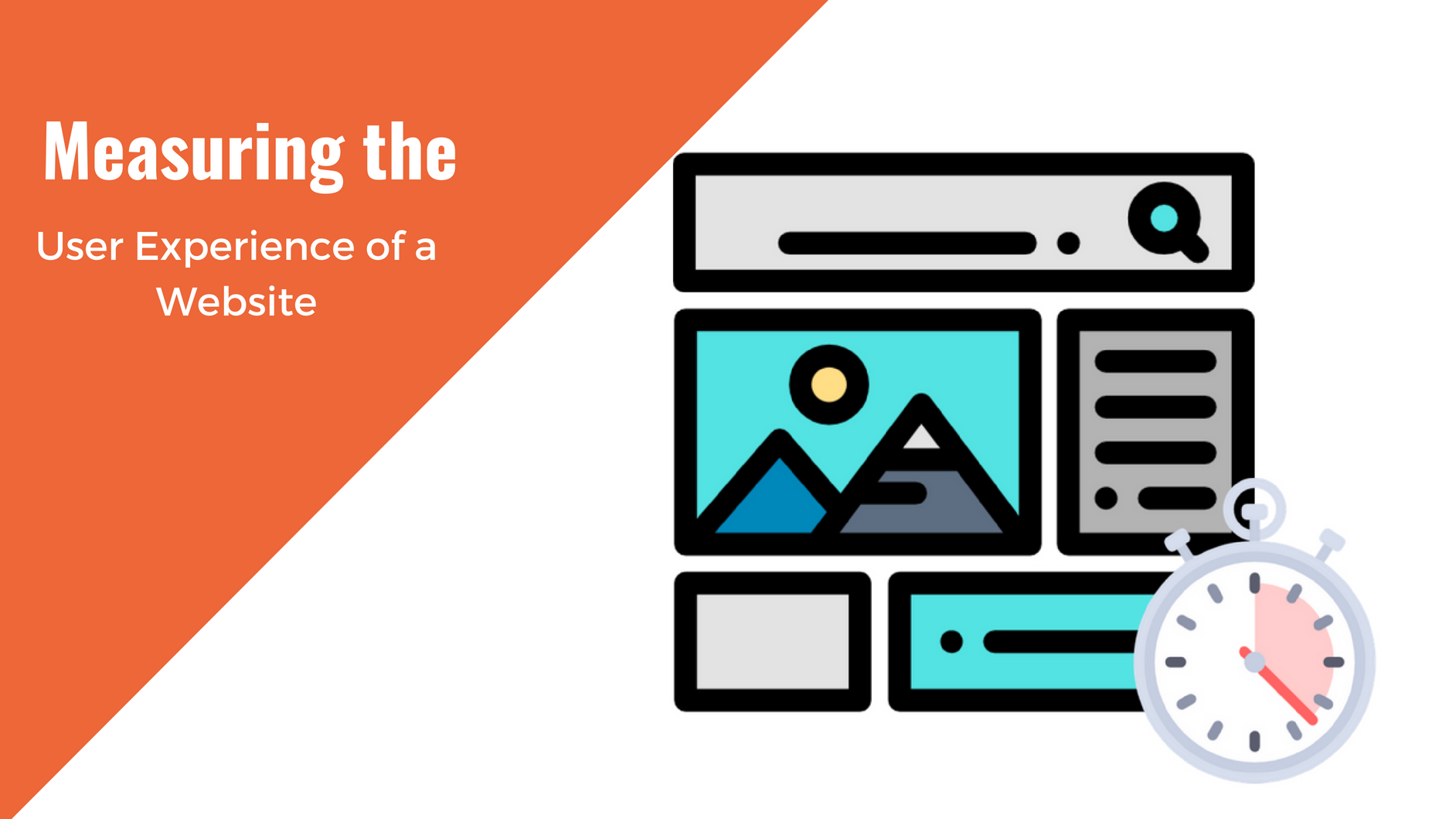
Having a website is an absolute necessity for any business. Gone are the days when you could simply update your website once and forget about it for months on end. In today’s ever-changing digital landscape it is important to constantly track and measure how well your website performs, as well…
read more >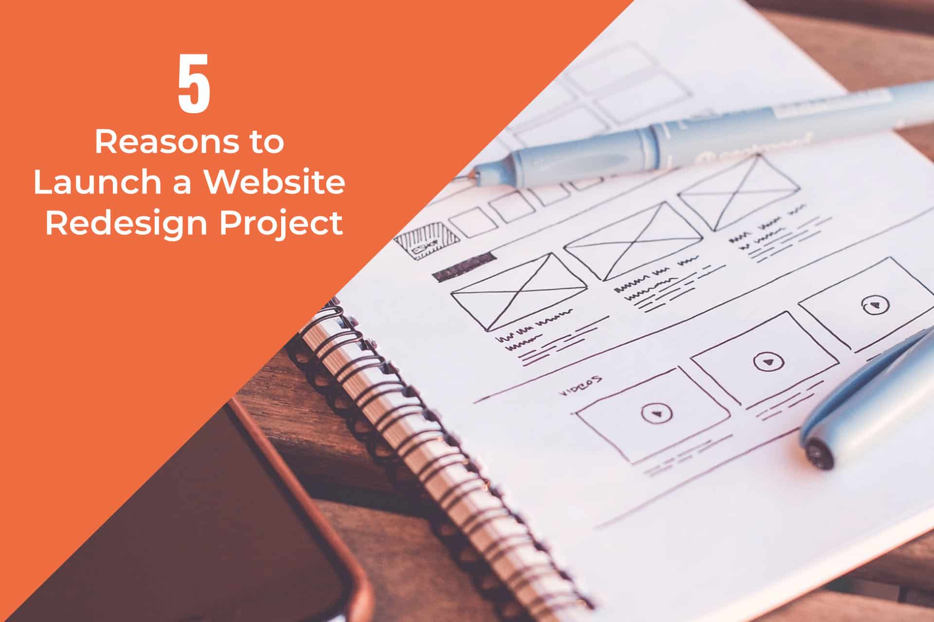
Thomas Bertram (T. Bert) Lance famously said, "If it ain't broke, don't fix it." Unfortunately, T. Bert Lance couldn’t foresee the future. He didn’t know that over 94% of Americans would be on the internet by 2024. If your website doesn't receive periodic updates or isn't accessible, users can become…
read more >