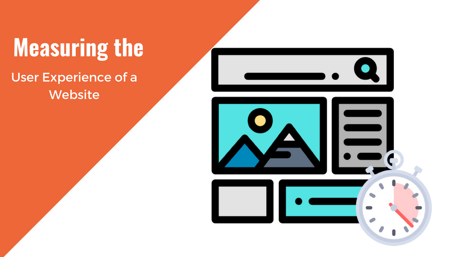
Every website operator faces the key challenges of how to attract and keep visitors. Let’s assume your organization’s mission is likely to attract wide interest. You are confident that many people will be supportive. But after a few months, Google analytics show visitor results disappoint. Great content does not make success if you fail to deliver the best possible user experience (UX).
 5 examples of mistakes in web design you should be aware of.

Consider how visitors reach your website
At one time you knew that people reached your website through a browser on their PC. Today a large percentage of consumers search the internet from mobile devices. Not only is a responsive website design mandatory to deliver an expected UX experience, it also is the first step in making your website accessible.
Websites designed to look great on a 24-inch computer screen do not display well on a 3-inch smartphone screen. A responsive web design determines the access device and adjusts to give the best view. Without a responsive site, visitors can find it hard to view the page from their mobile or those who use assistive technology may not be able to navigate. In both instances your user quickly leaves your site.
Avoid creating a website maze
No visitor should feel that they need some sort of “web GPS” to guide them around your site.
The more time it takes for them to work out where they need to click, the greater the chance they will give up. Effective use of headers and sidebars enhances usability.
Ensure that your users can search your site and find relevant information to their search.
It is especially important to provide clear information on how to contact you.
If you sell products or take online donations make the procedure as simple as possible. Give customers a choice of different payment options and an easy way to change the order or donation details.
 Check that links work and graphics display
Broken URLs and graphics that fail to display detract from usability. They also negatively affect your SEO efforts.
When the site was first launched everything worked fine but don’t assume it will stay this way. For example, suppose one of your links goes to a website that is no longer accessible. You have to find and correct “404: Page not found” errors before the user does.
It is also essential to optimize images for fast web display before uploading them to the site. Ensure all graphics have a resolution of between 72 PPI and 120 PPI to maximize UX. You can also use a WordPress plugin such as WP Smush, that will optimize your image for you.
Web design to please but not distract
People appreciate websites with videos, animations and eye-catching banners but don’t overdo it.
There is an old English saying about “not being able to see the wood for the trees.” In the website context, this means don’t allow any fancy design elements to obstruct your message. The first time the viewer sees that dancing figure it entertains them, but soon they’ve had enough of it. At the opposite extreme, a bland design also puts off visitors.
Find a balance between visual interest elements and web content.
 |
| Color palette from In Color Balance |
Think of fonts and background colors
Suppose your organization’s logo uses white letters on a pale green background. It might seem a good idea to exactly replicate this theme in your website. You would be mistaken.
You need contrast between font and background color to deliver good UX and maintain accessibility. While it may seem boring, black letters on a white background, or white letters on a blue background, are much easier to read. When in doubt, you can hire a graphic designer. They will be able to put together a color palette that can be used across your marketing materials, including your website.
You should also remember that san serif fonts, such as Arial, read better online. The UK government advises website owners to use “only clear, commonly used fonts. Avoid the use of small text. Users should have the ability to scale fonts.”
Web design that maximizes usability
With a little forethought and proper care you can do a great deal to improve your website’s usability. After investing so much in setting up the site and its content you want to get a full return on your investment. It is a real pity to let any easy to avoid web design mistakes reduce your site’s appeal.
Other articles you may be interested in:

Amar T.
Amar is the president and co-founder of AmDee. He has been an industry leader in accessibility compliance—auditing and remediating websites, publishing articles, delivering presentations to national audiences, and training content editors and developers in accessibility best practices.
You May Also Like
Having a website is an absolute necessity for any business. Gone are the days when you could simply update your website once and forget about it for months on end. In today’s ever-changing digital landscape it is important to constantly track and measure how well your website performs, as well…
read more >
Thomas Bertram (T. Bert) Lance famously said, "If it ain't broke, don't fix it." Unfortunately, T. Bert Lance couldn’t foresee the future. He didn’t know that over 94% of Americans would be on the internet by 2024. If your website doesn't receive periodic updates or isn't accessible, users can become…
read more >