Responsibly Going Responsive
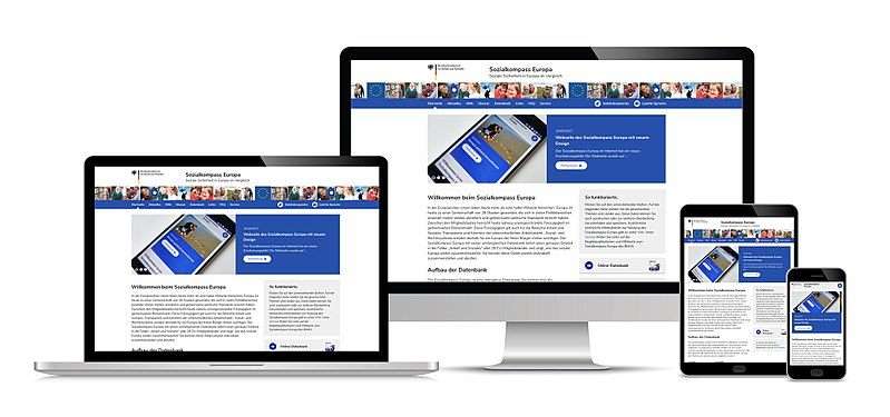
One of the main responsibilities for any website owner is making sure that your website’s content is accessible and readable on a wide variety of screen sizes, operating systems and web browsers.
The concept of responsive web design (RWD) was introduced in an Ethan Marcotte article just over seven years ago.
Its viewport meta tag, media queries, and flexible grid-based systems gave web developers and designers the tools to allow all website content to adjust and reformat to fit the various screen widths of the devices our web visitors were using.
With the addition of touchscreen commands, improved web browser capabilities, advances in HTML, CSS and more, the modern website has continued to evolve.
It is important that our websites keep up with the expanded capabilities of both the web and our user base. This does not mean you need to be incorporating all the newest bells and whistles available just for the sake of the pizzaz factor.
But what it does mean is that you should occasionally audit your website, or have someone do it for you. You should ensure that you’re giving everyone, from the iPhone X user to the blogger on a secondhand laptop still using Internet Explorer 7, the best and most complete user experience (UX) that you can.
10 Things to Check on Your Website
Here are a few suggestions for things you may want to look at on your website. While this list is by no means exhaustive, it is intended to give you an idea of some of the kinds of things your web visitors may encounter when perusing your site.
1. Missing UX Functionality. Are your mobile device visitors missing out on any functionality in their UX that is found in the laptop and desktop versions of your site?
Do a quick observational check seated in front of your desktop/laptop while also navigating your site with your phone.
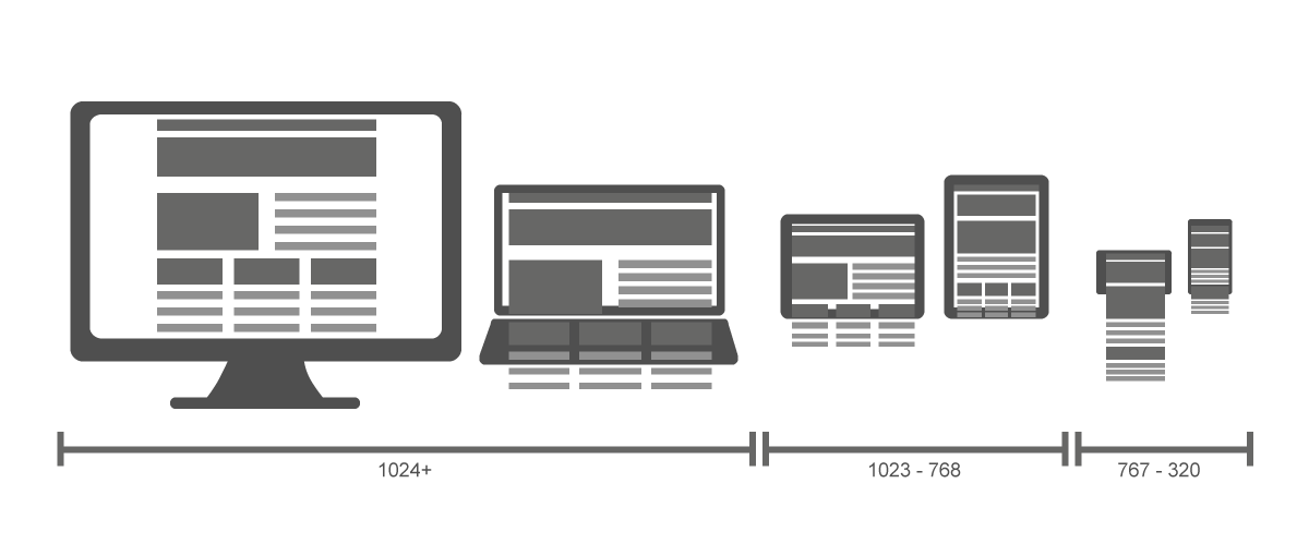
2. Viewing on all screen sizes. Revisit how your content adjusts for all screen sizes, and not just for the most common tablet and phone screen widths. Is your main navigation menu converting to a dropdown “hamburger” icon too early or too late? Are there any points along the way where a content block, section or image is not properly adjusting or displaying?
This test is easily done with a desktop computer. Simply set your browser to a full-screen view. Grab the right border with your cursor and slowly reduce the width of the browser window until you can’t make it any smaller. Failing gracefully during this exercise will ensure that your site is readable and accessible for all screen sizes.
3. Menus and Buttons, Size and Spacing. Are your menu tabs bunched too closely together, and are your touchscreen buttons and icons the minimum recommended size and width apart?
You want your menu items to be easily readable and, on mobile devices, for them to be accessible for users with big fingers. There are also creative ways to implement submenus for your mobile users, including accordions and sequential menus. Regarding tappable icons on mobile screens, Apple recommends they be at least a minimum of 44px x 44px. Pay attention to the margin and spacing of the area between them.

4. Removed or missing content for smaller screens. Are there content types which you simply don’t serve up to small screens, such as graphs or tables? Are those content types are an important component of your site’s usefulness? Think of ways that you can serve that content in text form or in landscape mode. You can also consider asking your web developer or designer for suggestions on how to include those content types for your site’s mobile visitors.
5. Thoughtfully repurposed navigation. Is your sidebar content being thoughtfully repurposed for a phone-sized screen, or is it just being pushed, as is, under your main content?
6. Do you have a “back to top” button for longer, taller pages and posts? This can be an easily overlooked item if only a few of your pages necessitate having one, but can always save your readers some scrolling time on tall parallax scrolling sites, lengthy articles and blog posts with lots of comments.
7. How is your site’s accessibility and 508-compliance on smaller screens? Have you run tests to ensure it’s meeting accessibility guidelines? Or have you downloaded our guide, here, to make sure your site is meeting accessibility guidelines?
8. Continuity across all devices. Can a mobile user get to the area of the site they want to go to as fast and logically as the laptop or desktop user can? Is the site architecture and flow still intuitive for smaller screens?
9. Are you serving up 2x images for hi-res mobile devices? While this is something you can’t always see with the naked eye, you can inspect various elements of your website with Chrome dev tools or ask for assistance from your web developer. In essence, a 96px x 96px image @2x will display at 48px x 48px on a retina display because a retina-ready display has twice the number of pixels.
10. Are you doing device testing, either with real phones and tablets or using trusted simulators to make sure your visitors are getting the whole experience?
Becoming Responsibly Responsive
While these ten checks are some of the more common things to look for when gauging just how responsive your website really is. You can also check with your staff members and even your readers to ensure due diligence. Solicit feedback through a brief email blast asking for customer UX suggestions for the site. Do some A/B testing or even invite some folks into the office for some (paid) user testing.
As web browsers, device capabilities and the overall user experience (UX) of being on the web continue to improve, it is vital that we all make sure our websites are catering to as many of our potential visitors as possible.
If you are a business or nonprofit wondering whether your website UX lives up to the standards which you expect, ask your web developer for help or feel free to drop us a line here at AmDee. And make your organization’s website responsibly responsive.
Note: Content has been updated as of August 8, 2018

Jeff C.
Jeff Creamer is a DC-based WordPress website administrator, tutor and consultant. He has been helping small businesses and nonprofits launch and manage their WordPress sites since 2013.

Kristy Bauman
You May Also Like
Having a website is an absolute necessity for any business. Gone are the days when you could simply update your website once and forget about it for months on end. In today’s ever-changing digital landscape it is important to constantly track and measure how well your website performs, as well…
read more >
Thomas Bertram (T. Bert) Lance famously said, "If it ain't broke, don't fix it." Unfortunately, T. Bert Lance couldn’t foresee the future. He didn’t know that over 94% of Americans would be on the internet by 2024. If your website doesn't receive periodic updates or isn't accessible, users can become…
read more >